Sunday, 20 November 2011

Main task progress

After a fairly long debate, and a written school survey, I have decided that the title for my magazine would be Rock&Roll.
  It is quite straightforward by my opinion, rock being the genre I want to promote. After a quick browse through the magazine section in WHSmith I saw that this title is not taken, so I've decided to use it.
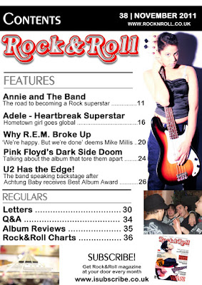
Next, inspired by the well known American music magazine, Rolling Stone's masthead, I've searched a similar font online and used it. Here's the first two pages (cover and contents) as a work in progress:

Monday, 14 November 2011

Semiotics theory

Semiotics is the study of meanings and signs. We have learned in class that there are three types of signs: iconic(which look like what they represent), symbolic (whose meaning must be culturally learned in order to understand it) and indexical signs (which are suggestive, and they could have more than one interpretation). Further, we took a quiz in class in order to familiarize ourselves with these three concepts. We found out, for example, that while an image or the name of a person is an icon of that person (an iconic sign), this
is symbolic and we have been taught it means 'No Smoking' and therefore we know its meaning unlike others who may not have seen it ever before and do not know what it stands for. Finally, a perfect example of an indexical sign is the Swastika.
Primarily used as a symbol of peace and good luck, time has altered its meaning so that nowadays it has a negative connotation, being associated with Hitler and Nazi Germany so to most people it suggests war and hatred. However in a certain amount of time from now on, this meaning could change again in people's perception - unlike the symbolic sign, it is not fixed.
Relating this to our media product, we've learned that we could use these certain signs for the cover of our music magazine to help us communicate particular styles, genres and other distinctive characteristics.
For example, on my magazine cover I have used the medium close-up of a girl, to represent the rock genre, which is a bit unconventional, although not uncommon (example of relating artist: Paramore's Hayley Williams) She is holding an electric guitar, which could be seen as indexical sign representing the rock&roll style: cool dangerous.

Activity 3: Research a music magazine

Title: Mojo
Price: £4.50
Publisher: Bauer London Lifestyle Ltd
Frequency of publication: Monthly


Music promotion
Lifestyle
Classified ads
Other
Name of times occurring
18
1    
3
7
Name of the product being advertised
CDs, live shows
and tour tickets
planet rock
DVDs
whiskey, magazines
(Empire, Q), plasma
Where in the magazine does the advert appear
every other 5
pages
127
8, 23, 126
87, 117, 129,147
What cost is the product (provide a ‘guesstimate’
£10.99
£5
£8 - £15
£10, £15
£500


This magazine is aimed at a more mature audience of about 25-43, its mode of address being formal but informative. it is a  well-known, quality music magazine promoting mostly the classic rock genre. The percentage of image to text is about one-to-three, and it is obvious that a main asset of the magazine is their long, in-depth articles and interviews. There is very little (if any) use if slang in the articles, which are written on a generally serious tone.

Sunday, 13 November 2011

Analysis of music magazine covers

Q magazine is a really well known British music magazine, which promotes not one but many music genres (soft and alternative rock, pop, hip-hop etc), this appealing to a quite wide audience ( I would say 16-35 years old). On the cover we can see a close-up of world famous Brit pop star Adele, standing sideways, her hair being blown back. This is suggestive, as we see the main cover story relates: 'Adele blows us away'. The masthead is also really proficient: it consists of a single letter title on a crimson red background, which makes the magazine more prominent so that it really stands out on news stands.  


Tottaly different from Q, Vibe is an RnB style magazine, and this is shown by the main picture of  male artist, which is mainly associated with hip-hop/RnB. The main colours used are red and gold and the font relates to the urban genre.  The singer, Akon, is also wearing a chain around his neck, which is viewed as an icon of urban music. The target audience is represented by teenagers and young adults because this magazine promotes up to date music such as RnB and Hip hop .
Finally, as a third example I have chosen a rather unusual magazine. Wire magazine seems to be an indie or 'modern music' magazine; it doesn't give away much information on the front cover,and also for the cover stories the editor has chosen to use a really small font, possibly to focus the audience's attention to the cover picture. Their use of this sort of picture could be classified as unconventional - a close-up of a person dripping wet - this doesn't seem to relate to music in any way, and it doesn't really attract a reader, but shocks one at a first glance. Supposedly, its target audience would be non-conformist young adults to middle aged people.

Evaluation of the preliminary task

My media product follows the conventions of a school magazine. The main feature on the front cover of the music magazine is the image chosen which is the picture of a student, holding an arts book. This has successfully attracted the intended target audience - which is the arts college student. The contents page was designed in the same style as the cover. I haven't made any major modifications but followed closely the mock flat plan I have drew for both pages. The design , the colours and also the fonts I have used proved to be effective and appealed to an audience. However, looking back on it, the title might use some improvement given that the concept of a school magazine doesn't come to mind after reading 'Artline'.

Monday, 7 November 2011

Finalised preliminary task

Given that not all the photos I have previously used for the contents page were mine, I have decided to use these instead:
And here is the preliminary task, completed and finalised: